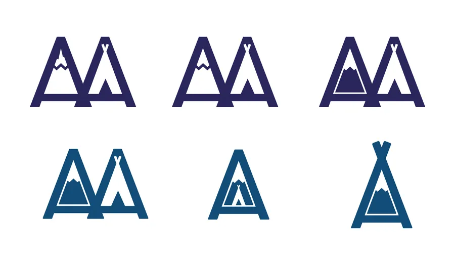
A logo for our family's homeschool program. The mark hides a tent and a mountain in its negative space, a nod to a curriculum built around getting outside.
I intentionally avoided leaning on "school-ish" elements — books, apples, that sort of thing. They read as overwrought and dominant; more literal than aspirational. The tent and mountain do more with less.
I later found out the name was already taken — ABCmouse had a product called Adventure Academy. Ah well.
Originally posted on Dribbble.