
For years, I've long found myself messing around with an initial-mark when initialing forms of some sort. The two pairs of perpendicular lines were begging for more attention.
The mark & scheme were inspired (knowingly & subconsciously) by a few things. Most of these rationalizations are post-hoc: observations & reflections that couldn't have been verbalized at the outset, but meaning emerges throughout the process. I think this is true of most brand/logo/art explanations, and I've tried to minimize pretense & puffery in mine.
The characters themselves
The simple geometry is undeniable. Straight, confident strokes and right angles. They're almost as basic as type gets and they own it. Each of these explorations below had their beginning in sketchbooks & mortgage paperwork.
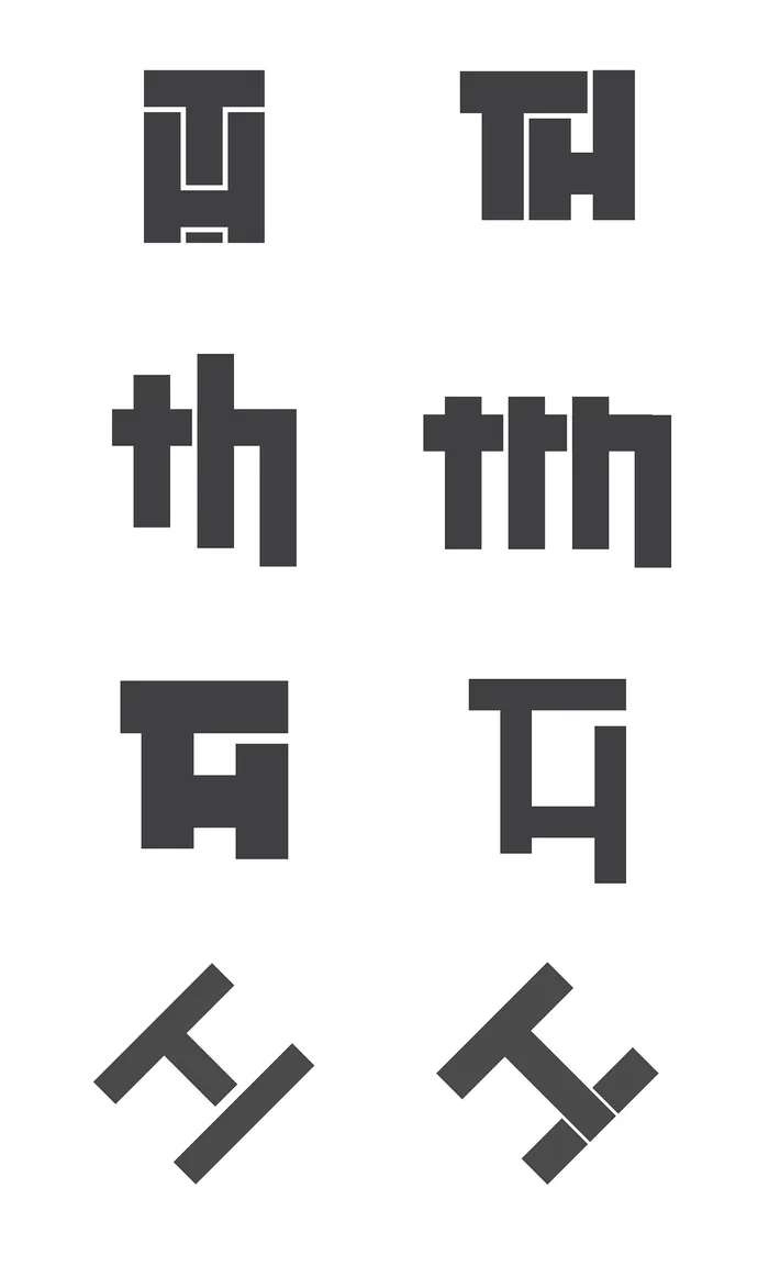
In the end, I gravitated toward simplified lines & geometry. I had tried several iterations with thinner lines, but they stood too weak.
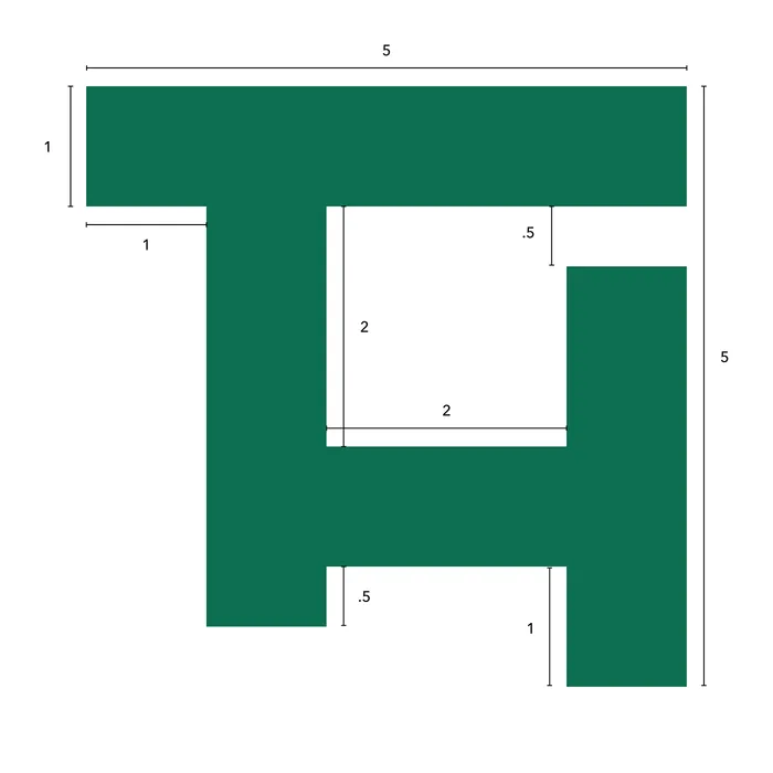
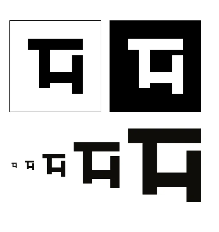
Black, white, & size variations
My Scottish lineage
Each side of my family has a significant dose of Highland heritage. Kilts, tartans, & everything. I grew up watching the caber toss at various Highland festivals as my sister competed in the highland dance contests. I enjoyed bagpipe music.
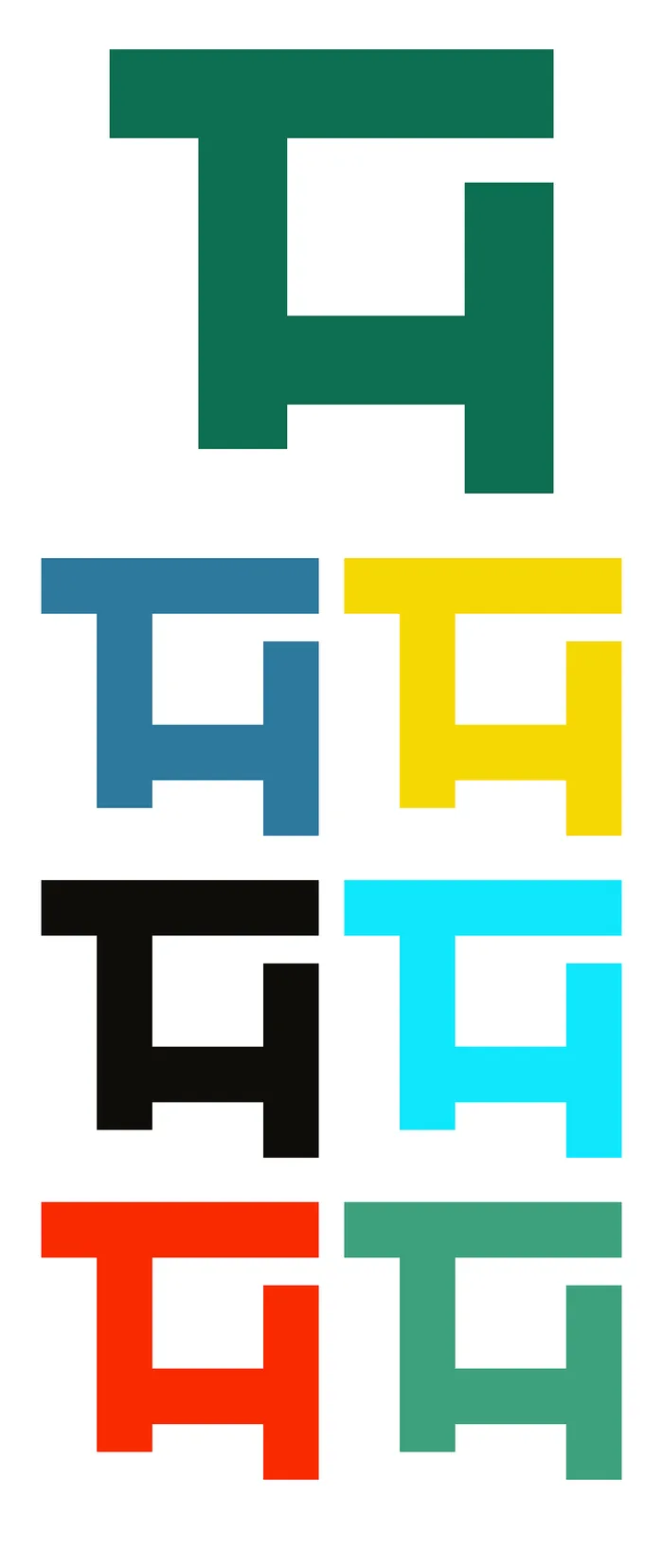
The color palette is pulled from one of my family tartans, the Macinnes Ancient Hunting pattern. The top row of colors is what I've run with; the others were other considerations pulled from the fabric with a color picker.
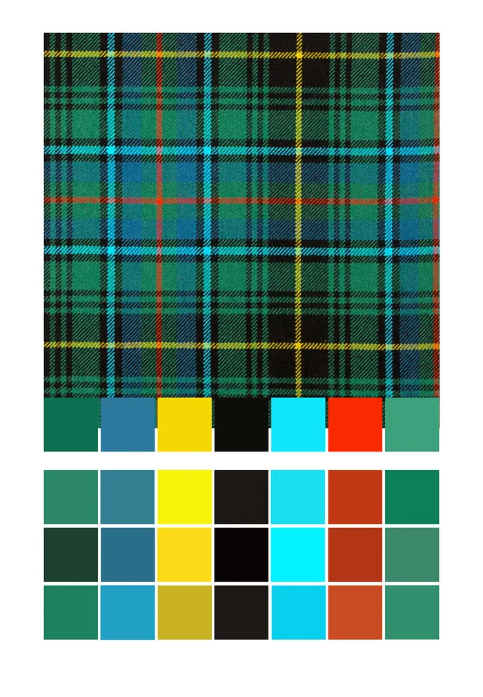
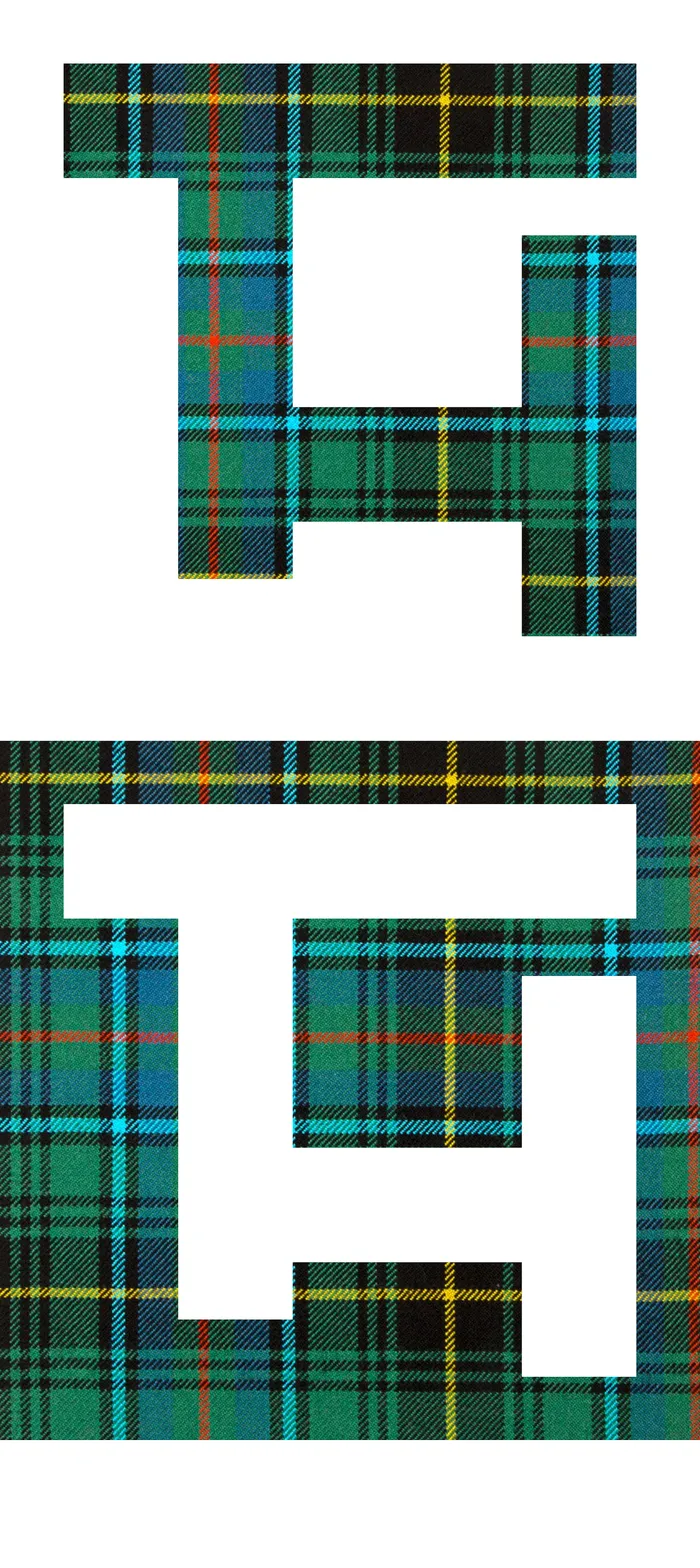
Conveniently, the aforementioned 90-degree letterforms echo the criss-cross of tartan warp and weft.
Architecture
Since I was a kid, I've been messing around with architecture. CAD floorplans for fun, sketching landscapes in my spare time.
My Instagram feed, an easy reference point for my architectural interests, consistently pulls from a few quasi-paradoxical themes: thoughtful/unexpected/clever design, Scandinavian simplicity, & rugged, mountain cabins.
I like that the mark evokes for me a mountaintop retreat: the stable, wide stance of the H & its descending stems like downslope deck support posts. The outstretched arm of the T reaches out like a cantilevered roof, sheltering what's underneath while providing room to move and play and see.
Serendipity
I was moving some of these forms around and digitally stumbled onto a layout that just worked. I ran with it & am really — strangely — pleased & excited about these arrangements.
In the end, I don't know where I'd consistently use any of this. I work at Crema; I'm not a freelancer doing brand/identity work; I don't really need a Personal Brand™ to this degree. It's been a fun exploration & explanation exercise, though, one that gets me outside of my product-centric tendencies.
Originally posted on Medium, June 2019.